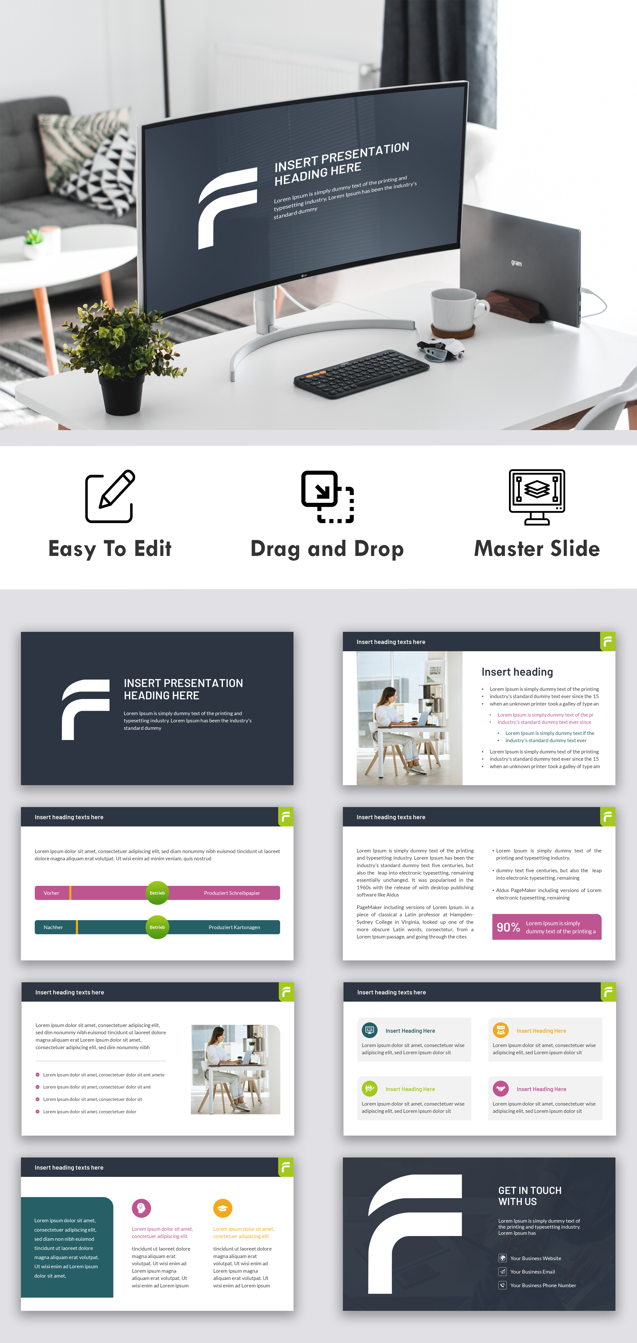
Dr. Ferstl – a specialist law firm for employees, works councils, and trade unions – needed a professional, engaging presentation design for their webinars targeted at works council members. The client requested a structured, clean visual system with specific typography and brand colors: black (#1f1b1e) and green (#a6d625), using Lato and Barlow fonts.
Design Process:
I began by developing a balanced color palette—pairing the defined green with petrol shades and soft grays to harmonize with the black tone. Rounded rectangles and minimalistic arrows were designed for better visual guidance. A modular master slide layout was created, ensuring consistency across graphic, text, and image sections. I refined bullet styles using soft green and circular shapes to improve readability. Special layouts for title, chapter, and text-only slides were custom-designed for structure and clarity.
Result:
The final design elevated the webinar experience—modern, accessible, and aligned with the firm’s identity, resulting in improved audience engagement and visual consistency.
Modern Webinar Presentation Design for Law Firm